If you follow me on Instagram, you'd know that I'm currently obsessed with bookstagramming. I'm pretty sure that's not an official word yet, but people who do it would know what I mean. Basically, it means taking pretty pictures of books. There are different ways to take such photos, but one of the more frequently seen styles used for bookstagramming is flat lay. Basically (oh, wow, I've used this twice now but hey, this piece isn't something I'm selling so let's just keep it that way so everything feels natural :P), it's taking a bird's eye view of your subject, and I don't know about you but it took me a loooooooong time to figure the ins and outs of it.
I still don't consider myself an expert and if you think that's false modesty, well you can just compare my photos to those of (my inspirations) New Leaf Writer, Folded Pages Distillery (awesome handle, right?!), and Betty Books, and you'll know. I am no expert (but yes, naturally, I hope to be really good at it one day).
I have good and bad days flatlaying, and usually during my off days it's like nothing comes together no matter what I do. In my good days, though, I can easily envision the layout in my mind and when I start doing it, everything comes together.
Anyway, I actually wrote a post like this in my personal blog but I thought I should also share it here, in case you're interested in using this as your de-stressing technique. I often say I'm de-stressing, and basically that's the time when my mind's too concerned about things it's not supposed to be concerned about (i.e. what my readers would think about my WIP). It's not that I don't care about my readers - of course I do, duh - but there's a RIGHT way to care.
If you worry about readers saying you're a shitty writer and how embarrassed you'd feel, then that's just pride talking. I hope you get what I mean.
Well, anyway, those are the moments when I need to de-stress and look to bookstagramming for relief. I sucked at it big time at the start, but not so much now and I'm going to share with you a couple of tips and tricks I've discovered in my (ongoing) flatlay journey.
1. Draw inspiration from other bookstagrammers.
I've mentioned a couple already above, but you can look for your own sources of inspiration just by checking out #bookstagram on IG. You'll notice a couple of similarities, like the fact that they often use a white plain background and candles - there are a lot of books-and-candles posts. The same things may or may not work for you - you just need to experiment and find your own "style".
2. Lighting is everything.
One of the reasons why I had a hard time with bookstagramming at the start was because I hadn't been able to find the perfect lighting for it. Natural lighting is best, but if not then look for a place in your home that would allow you to take top-view shots without casting shadows. Once I found that perfect spot in our home, everything was a loooot easier. It will be the same for you, too!
3. Choose backgrounds that you feel inspired to work with.
Although I often see plain white backgrounds used in bookstagrams and I have given this a try, I don't really find it all that inspiring and exciting to work with. Actually, it's a struggle for me, and I've just learned to accept that plain-white backgrounds don't suit my personality. It's too...elegant, and I am far from being elegant IRL. Maybe this is just me (with regard to the process), but it's what I feel.
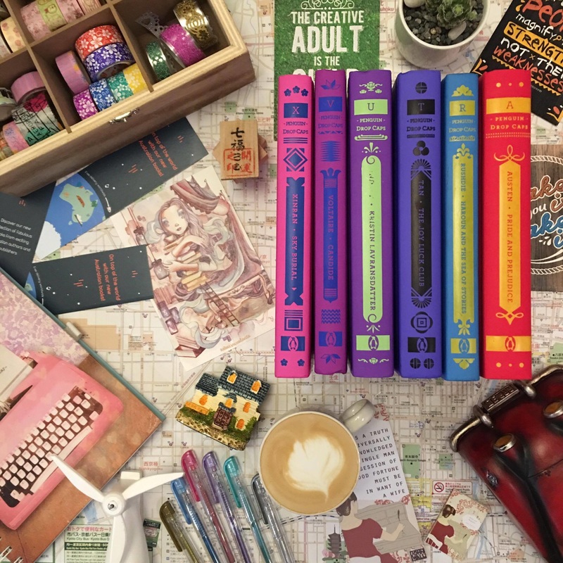
Another thing I've noticed is that maps are also a frequent background choice for bookstagrams, and when I gave this a try, I was very much surprised that it worked extremely well for me. So yay for that!
P.S. The map I use for my bookstagram posts (seen in the photos below) is something I got for free from the Kyoto train station (hehehe).
4. Choose a theme.
It's what makes choosing props for your posts easier, but I don't think it's always necessary. Color can be a theme, or in this case, I displayed books in the same collection but I also wanted to highlight two titles because they both had a scientific theme going on (titles are self-explanatory, yes?). So with that in mind, there were certain props that were no-brainers and which I knew would go perfectly well with these books.
Ruler, compass, pen, and that silver thing on the lower right - I have no idea what it is, actually. It's my boyfriend's but when I saw it I knew right away it had to be in my photo, hahaha! Everything feels, err, brainy, right?
Oh, and when you have more than one book in your photo, you may need to use a bookend / book stopper (if you see flashes of pink peeking out in my photos, that's it).

Added a couple more geeky things or at least something with the same feel.
- Normally, I use my more colorful pens (metallic) but those felt too girly for this photo so I opted for something more 'serious'.
- Added more stuff from my boyfriend, and I still have no idea what they are.
- The sticker sheet and Little Prince notebook are examples of props that have the same "feel" but have nothing to do with the theme, haha! Or they just feel right to me at least. :P

Now, the lower left corner feels a bit too empty to me so I added graphing paper to this part.
Sometimes, I take a "peek" at the layout to check spatial arrangement between props. Basically, I hold my phone over the entire set and look through it, then move objects here and there until they're spaced properly.
Sometimes, I take a "peek" at the layout to check spatial arrangement between props. Basically, I hold my phone over the entire set and look through it, then move objects here and there until they're spaced properly.

I've decided to flip the notebook over and show its back cover instead becauseI felt "The Little Prince" was too distracting. I think it worked better this way, right? And if you've been wondering about the glaringly empty space in the middle, well, that's the spot I reserve for my cup of coffee, hehe.
Warning: You should do all of these preparations prior to having your coffee made. Because if you do it the other way around, your coffee will taste blah by the time you're done. >.< Trust me. I speak from experience. :D That or AT makes coffee more quickly than I can bookstagram. DAMMIT.
Warning: You should do all of these preparations prior to having your coffee made. Because if you do it the other way around, your coffee will taste blah by the time you're done. >.< Trust me. I speak from experience. :D That or AT makes coffee more quickly than I can bookstagram. DAMMIT.

Something you rarely see with bookstagrams are behind the scenes photos. I mean, what kind of work gets into those photos? Don't you ever wonder about that? I know I do, all the time, especially with photos that have SO MANY PROPS!
Well, here's what happens when I bookstagram.
Well, here's what happens when I bookstagram.

And believe me, I've been really methodical already with my choice of props. When my thoughts are all over the place (which they often are), it looks more like a disaster zone like the photo below---

Ah! May tsinelas pa!
To filter or not to filter
Now, I used to be really fond of filters for bookstagramming but because most people seem to prefer otherwise I've stopped using it and instead started playing around with the built-in editing options of IG. So far, I really find tools to sharpen / brighten the photo really useful. I also like playing with levels for warmth / structure / fade / highlight, depending on what the photo needs.
Here's the before / after of my first non-filter photo.
Here's the before / after of my first non-filter photo.

Too vivid, eh?
Here's another one, which is one of my faves because it's my first attempt, using a white background (although obviously it's not completely white, I still used a patterned background for a portion of the photo).
Here's another one, which is one of my faves because it's my first attempt, using a white background (although obviously it's not completely white, I still used a patterned background for a portion of the photo).

Layout changed a bit, too, but more than that, with the help of editing, I made the white background brighten up a lot, which I really liked. Another thing I realized with this particular bookstagram is how it's essential for your backgrounds to blend with each other when you're using more than one. The red background really didn't do it for me.
With a wood background...
With a wood background...

I think it's better to make things more...mm...golden? See below. Right?

Clean vs. Messy
To compare the two, here are bookstagram posts styled by my cover designer CT.


Either is great. You just need to find which works better for you. With messy layouts, you need LOTS of props, and theme is even more important. With the latter, you need to play around with spacing, and since you're working with fewer props, everything you add to the photo matters. :D
And that's it! Hope you enjoyed this post as much as I enjoyed writing it (which was as relaxing as bookstagramming itself actually haha). If you have questions, just let me know! ;) I love talking about this, OBVIOUSLY! :D
And that's it! Hope you enjoyed this post as much as I enjoyed writing it (which was as relaxing as bookstagramming itself actually haha). If you have questions, just let me know! ;) I love talking about this, OBVIOUSLY! :D